From iPad to iPhone
Snapp, originally designed for the iPad, was being developed to become available on mobile phones. The primary challenge was transitioning the content to a space with less screen real estate.
Building for Busy
The median age at PwC is 27, making it a millennial dominated workplace. Employees are very well versed when it comes to technology and using their mobile phones. However, Snapp was originally designed for Partners who were always on the go. These user personas dive in deeper to the older demographics of employees who would be using this app.

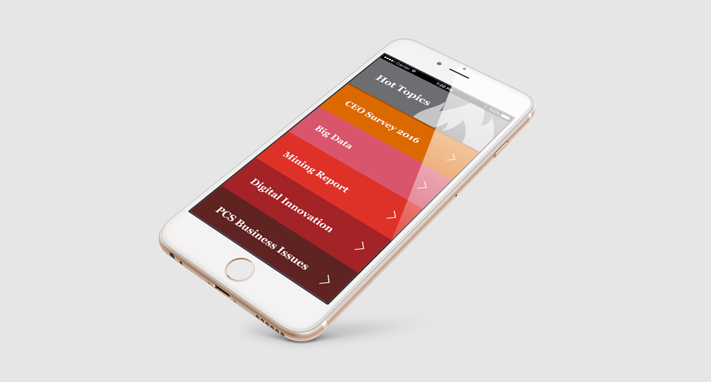
Snapp 1.0
The five tabs featured were: 30 Second Quick Read, In the News, Read, Learn & Share, Scenarios, and Contacts. I compared different news apps to see their overall structure and design. From this, I created a basic linear wireframe and user flow.
User Flow Chart


Playing Around with Navigation
I experimented with different styles of navigation to see what worked best. Making the navigation clear to the user was essential.
User Interviews & Testing
During my internship at PwC, I managed the Snapp App booth at the month long Assurance Summit Conference. I was able to educate employees about the Snapp App, increase awareness and drive user downloads. While working at the Summit, I was able to interview employees and conduct user tests using the current iPad app. I was able to carefully analyze their behaviours and take some quick notes. This information allowed me to identify the major stressor points of the design:
- • Use of left hand tab style navigation
- • Home button accessibility
- • Touch screen sensitivity
- • Content & visual cues
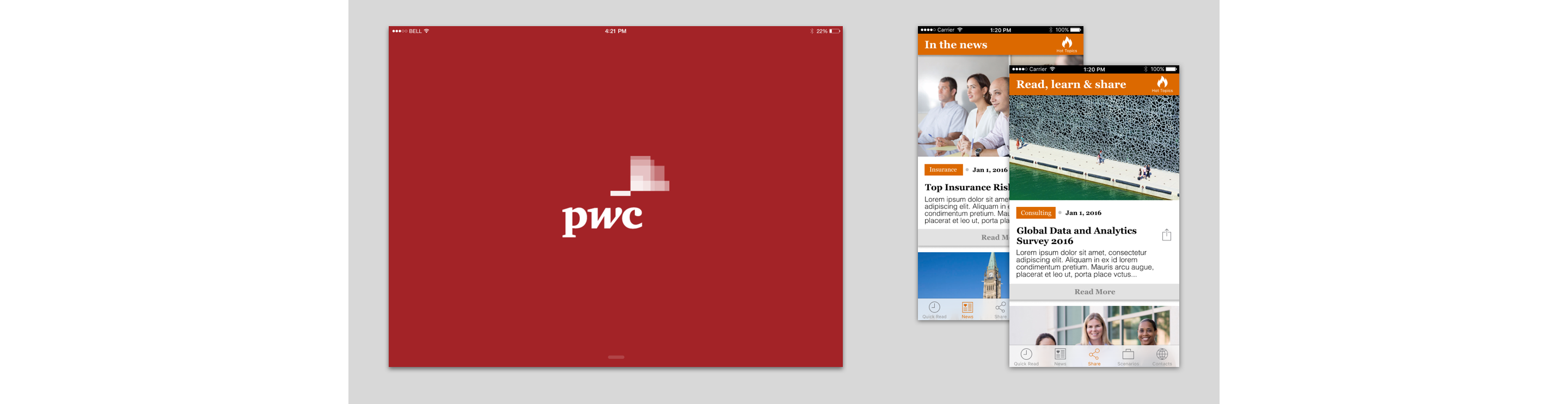
Snapp 2.0
By the end of my internship, we had designed up to Snapp 1.0. For me that wasn’t enough — I continued to build out and iterate the designs, based on the user research and brand guidelines. I was granted permission to use this project as a portfolio piece. The final design is pictured below.